Refreshing a student learning platform to make learning more fun
April 2021 - May 2021 (Freelance)
Refreshing a student learning platform to make learning more fun
Almost Fun is a non-profit that builds tools for marginalized students to improve their math skills.
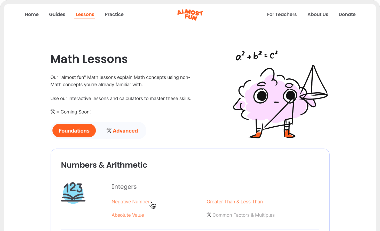
Almost Fun Math Lessons landing page.
Overview
In 2021, the nonprofit Almost Fun collaborated with Daybreak Studio for a visual identity rebrand, and I joined as a contractor to take lead on creating a component library for their web product that teaches students math lessons. Working closely with the client and Daybreak’s design team, we were able to deliver a comprehensive system that provided building blocks to visually refresh Almost Fun’s learning platform.
Problem
As part of Almost Fun’s rebrand, the non-profit needed a library of reusable components to visually rebuild, expand, and make their web product consistent with their new brand.
Some tidbits from designing the component library ↓
Initial component audit
To start this project, I took a deep dive into what Almost Fun originally had in their product pre-rebrand, to inventory what components needed to be redesigned and to scope delivery expectations. Using this inventory alongside Daybreak’s new brand guidelines, I was able to visually explore new components, product layouts, and typography throughout Almost Fun's web product.
Existing component inventory.
New type system and select brand colours.
Colour coordinated cards
After identifying the different sections that make up all math lessons, I assigned a colour to each section and used iconography to tie elements together. Lessons are made up of these cards, and expand vertically as students progress through the lesson.
Colour coordinated cards that make up sections in a math lesson.
A lesson card in context on desktop and mobile.
Navigation
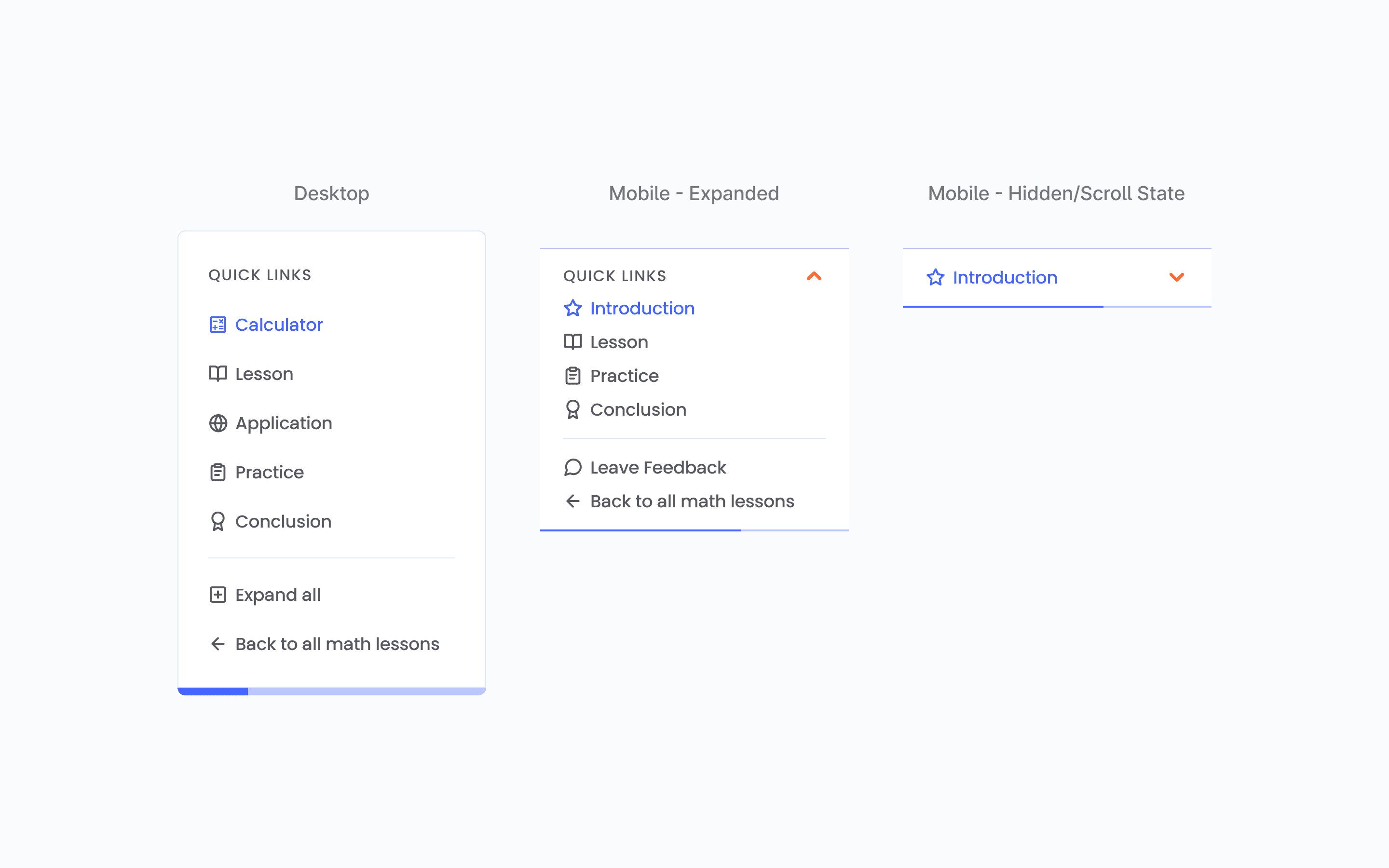
After learning from the client how students quickly moved between lesson content, one component we wanted to get right was navigation. I included a progress bar within the navigation to allow students to visualize progress in their lessons, giving students a better idea of remaining content within a lesson.
Quick links navigation component. The progress bar stickied below the card grows as the lesson progresses.
Generic components
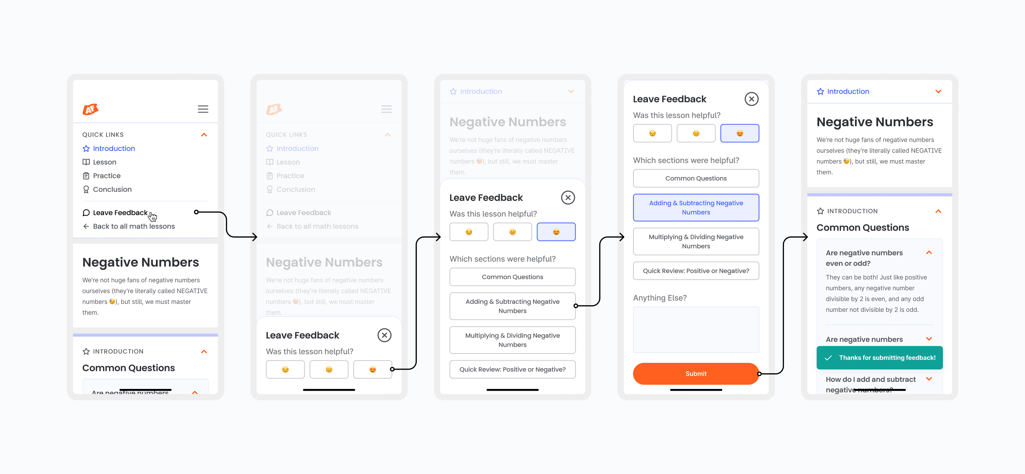
After identifying that most lessons were built with typical design system components like buttons and toasts, I designed these components accordingly for the client to be able to reuse and build lesson layouts.
A sample flow containing multiple components like cards, selection controls, buttons, and toasts.
Form fields.
Tables.
A page from a slide deck overviewing component deliverables to the client.
Putting it together
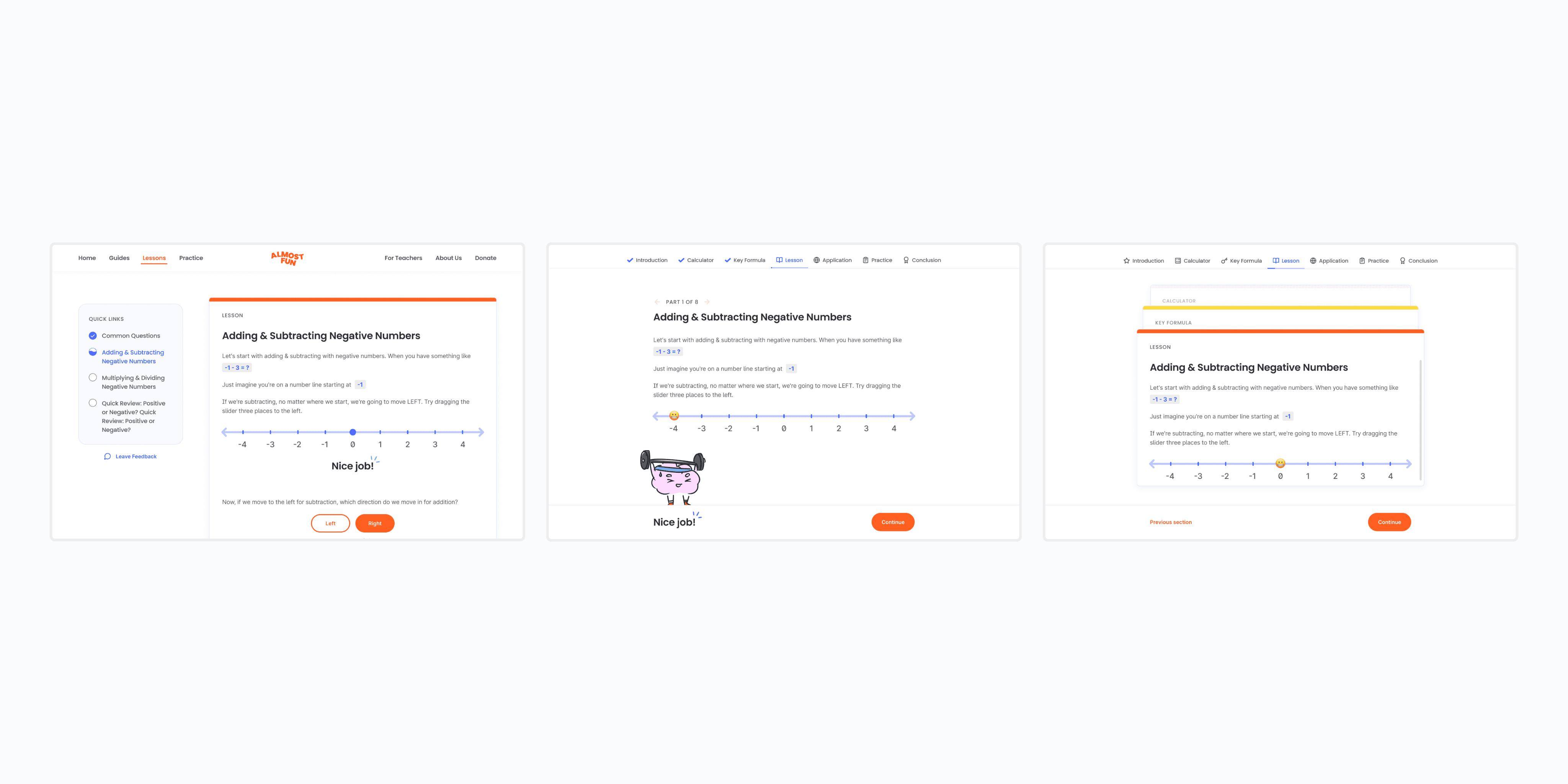
After presenting different proposals for the math lessons product layout, the design that was chosen highlights main lesson content, while allowing students to jump into different sections through the stickied navigational “quick links” menu. To encourage students, we made sure to include affirmations while students progress through content, and including the new Almost Fun mascot into lessons as well. You can find out what shipped at Almost Fun’s website.
Sample math lesson in desktop and mobile screen sizes.
Some takeways
Though I was only contracted and staffed on this project for a month, it was a great experience collaborating with Daybreak to bring this project to life and see a playful and colourful rebrand shipped. From working alongside a talented, fast-paced team, I was able to leave with the following takeaways.
1. Push your explorations 🎨
One of my biggest learnings working with Daybreak was to think outside the “easiest” engineering solution, and to really have fun and go beyond what's expected during the exploration phase. Prior to this project, I often designed in a manner to build what’s tried and tested, but designing in a blue-sky manner helped me to rethink my approach to come up with creative, delightful solutions.
Different explorations of the math lessons layout.
2. Actively seek feedback and take notes during design critiques 📝
The Figma component I used the most during this project was sticky note annotations. This was something I brought into every design critique and feedback session. I found that actively taking notes of stakeholder feedback allowed me to keep track of client asks, while visibly making sure that I’m engaged and actively listening in discussions.
Client feedback from a design critique.
Little retrospective
This project was the start of my short little design agency stint, and taught me what goes into a rebrand beyond visual work. Throughout this experience working with Daybreak, and later other agencies like Airfoil and Lazer Technologies, I was able to learn how to work with a diverse range of clients in fast-paced environments. Though I eventually moved to in-house product design, I’d definitely consider the agency world again in the future as a way to push and improve my craft in the future, while working on fun client projects :’)


