Launching PC Health into the app store
Summary
As part of League's new partnership, I supported all aspects of design to deliver PC Health into the App Store, working on everything from the design system, feature refinement, usability testing, illustrations, and prototyping for stakeholders.
May 2020 to August 2020 (Internship)
Launching PC Health into the app store
An internship recap that overviews my work on PC Health, an iOS and Android app built by League in collaboration with Loblaw.
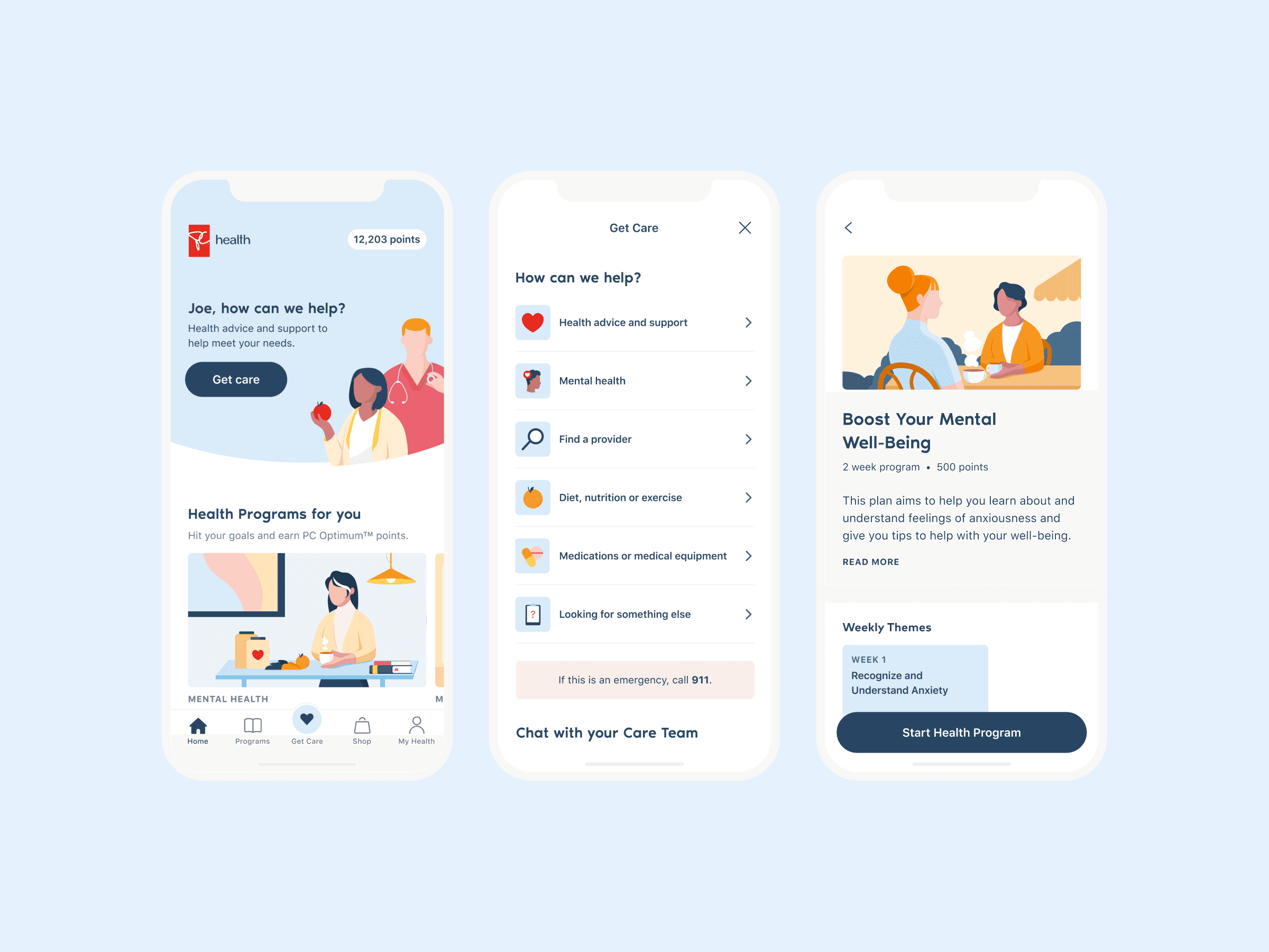
PC Health's homepage, Get Care feature, & Health Programs feature.
Project Brief
Company: League Inc.
Client: Loblaw Companies Ltd.
Role: Product Design Intern
Timeline: May to August 2020 (4 months)
Context
League is a health-tech company focused on providing customers access to virtual care and various health improvement programs. Under the company's growth and partnerships initiative, League worked in collaboration with Loblaw, Canada's largest pharmaceutical retailer, to build PC Health: a mobile app directed at engaging Loblaw's 16 million PC Optimum loyalty program members.
My Role
Internally, the PC Health project was dubbed "Roadrunner", and throughout my internship I had the chance to support PC Health's ongoing design efforts in preparation for the app's initial launch in September 2020. During my internship, I was able to work on all aspects of design and research for the app, while collaborating closely with visual and product designers, developers, a product manager, a copywriter, and even the business development team.
Problem statement? Let’s reframe PC Health as an opportunity.
League's mission is to empower people to live happier, healthier lives. While League achieves this through its own Health Benefits Experience (HBX) product, its audience reach is only limited to employees who work at customer companies like Shopify.
In order to achieve its mission at scale, PC Health allowed League to expand reach and empower more people to live healthier, while creating a new revenue stream through partnerships.
Approach
With the goal to expand reach and to scale League's business, the Powered by League Partner Program was announced. The program aims to grow League by selling core product features to a strategic partner with an appropriate audience — in this case pharmaceutical brands that align with League's mission. To scale, League took an approach to white-label its HBX product.
Definition
A white-label product is a product or service produced by one company that other companies rebrand to make it appear as if they had made it.
Existing screens in League’s HBX product. Key elements that needed to be updated included improvements in the design system, a revamp of the “Get Care“ feature to contact care providers, and a marketplace update to reflect PC/Loblaw offerings.
In partnering with Loblaw, some challenges to this approach included the need to iterate and improve HBX for both parties, while evaluating which features could be taken and be made context-specific to Loblaw.
PC Health
PC Health is a mobile app available on iOS and Android that offers real-time virtual care with a trusted team of nurses and dieticians. By collecting health information on users, the app is able to use data to recommend personalized health and wellness programs, shop for health-related products, while allowing members to earn PC Optimum points.
Ultimately, PC Health was a large-scale team project with about 100 internal collaborators from different functions. There were many moving parts that I was able to work on, which I'll overview below.
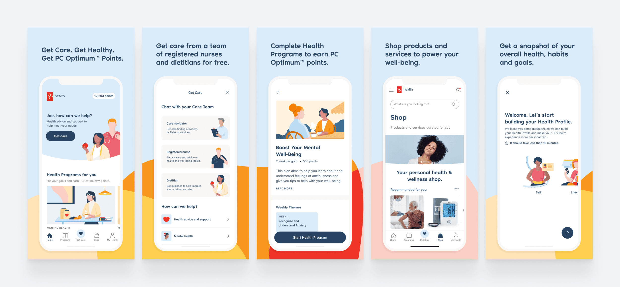
PC Health App Store assets created alongside League’s Product Design Lead (Diogo Ramos), Visual Design Lead (Brenda Luu), and Copywriter (Jennifer Nicholson).
One Design System, Multiple Brands
Design systems enable consistency and efficiency at scale, and this fact was especially important for building PC Health from a development perspective. League was able to take advantage of its existing design system, Genesis, by sharing components with underlying functionality between HBX and PC Health.
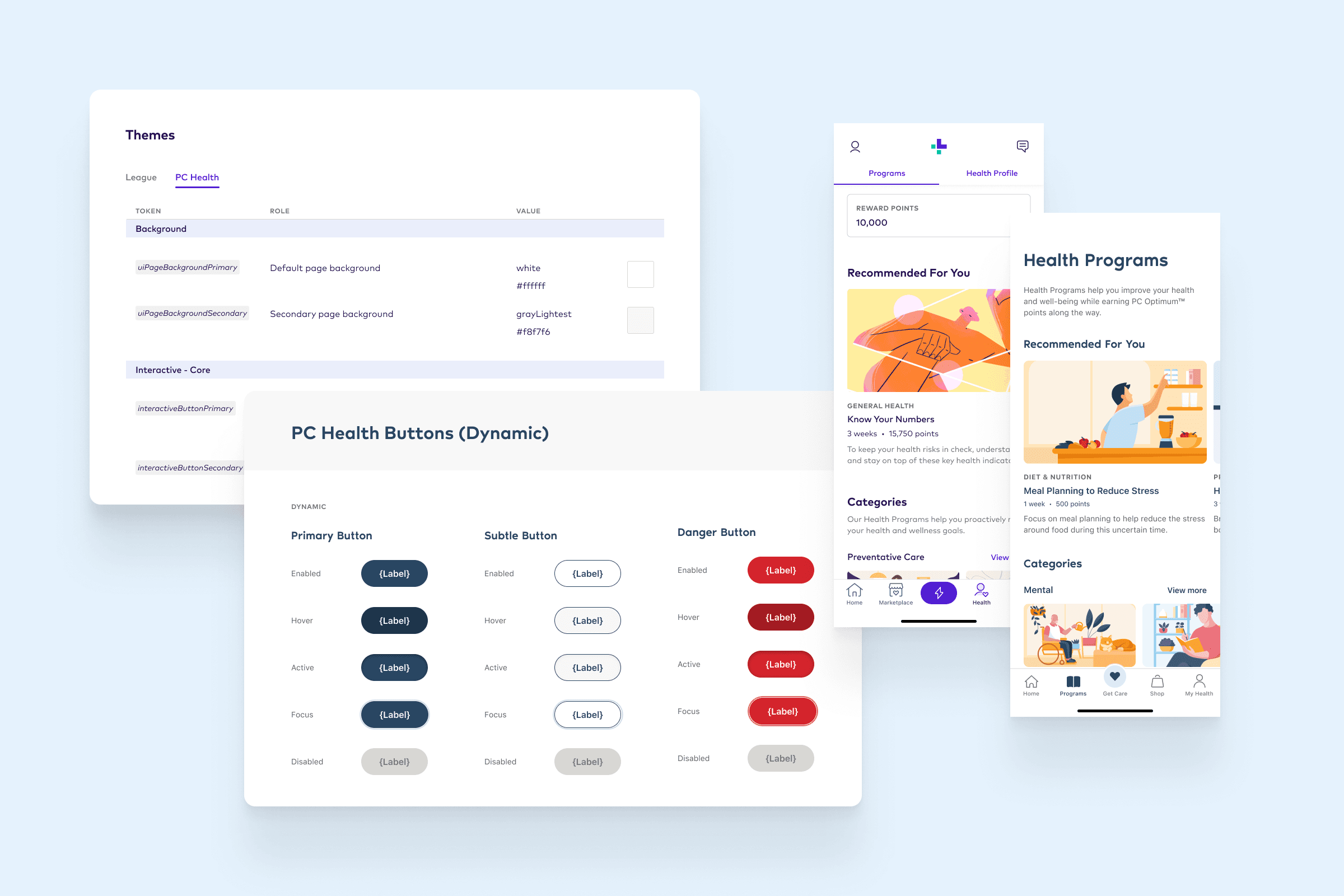
From the design perspective, this meant restyling components in a manner that reflected Loblaw's PC branding, while maintaining WCAG accessibility guidelines. I was able to prepare Figma assets for new components, while creating documentation for developers as well. This process was critical for designing at scale, as League’s team of designers could quickly reuse components as a result.
A sample of my design system work, from re-mapping colour tokens, Figma component creation, to auditing existing League HBX assets to restyle.
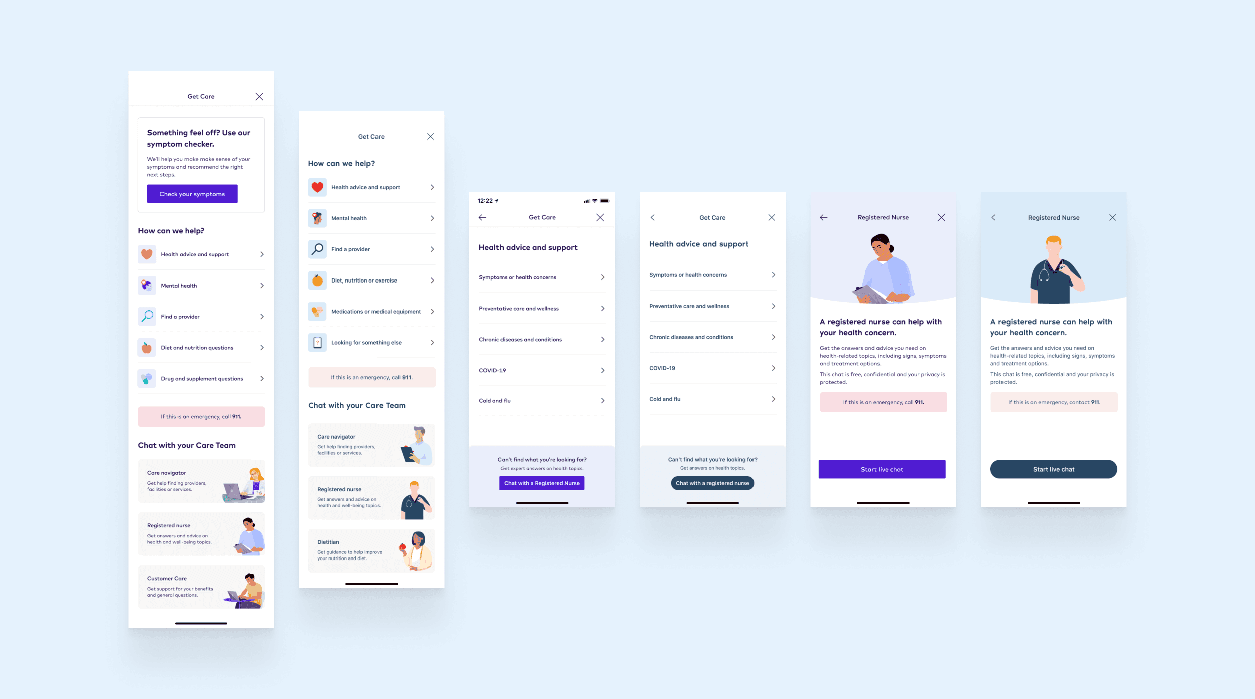
Get Care
Get Care, League's feature that enables users to speak to nurses and dieticians, was one of the features that needed improvement before being modularized and ported into PC Health. What was initially a simple way for users to immediately chat with healthcare professionals needed to be adjusted for a larger intake of users, given that PC Health and League would share the same team of virtual care professionals.
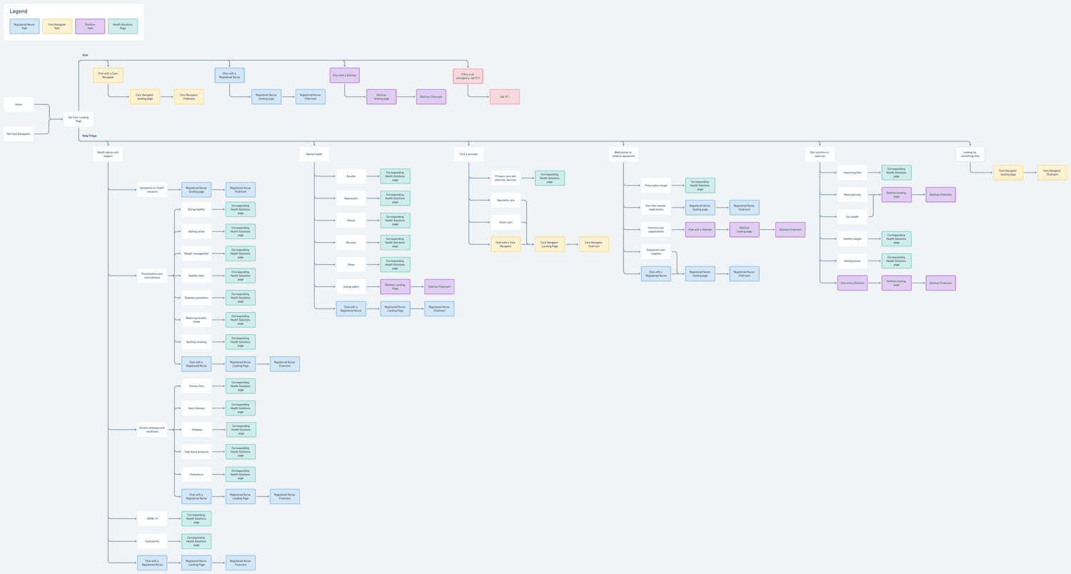
Updated user flow for Get Care, created in Whimsical (RIP).
This lead to the design problem of needing to reduce unneeded chats, while still providing valuable information to users regarding their health concerns. The result was the Get Care Triage, a redesign that would reduce League’s cost-to-serve by enabling users to:
chat with a healthcare professional only if needed,
be directed to relevant articles based on their health concerns,
better understand what the Get Care feature entails with descriptive landing pages.
Sample Get Care screens for both League HBX and PC Health.
PC Health Get Care flow prototyped.
While this design effort was lead by my design lead, Diogo, I was able to support the project by:
creating iconography for the triage landing page,
mapping out the user flow with all possible endpoints,
gathering feedback from internal stakeholders on the feature,
ideating on the expansion of Get Care to include a symptom checker,
and conduct evaluative research to test the Get Care triage.
Health Programs Visual Rebrand
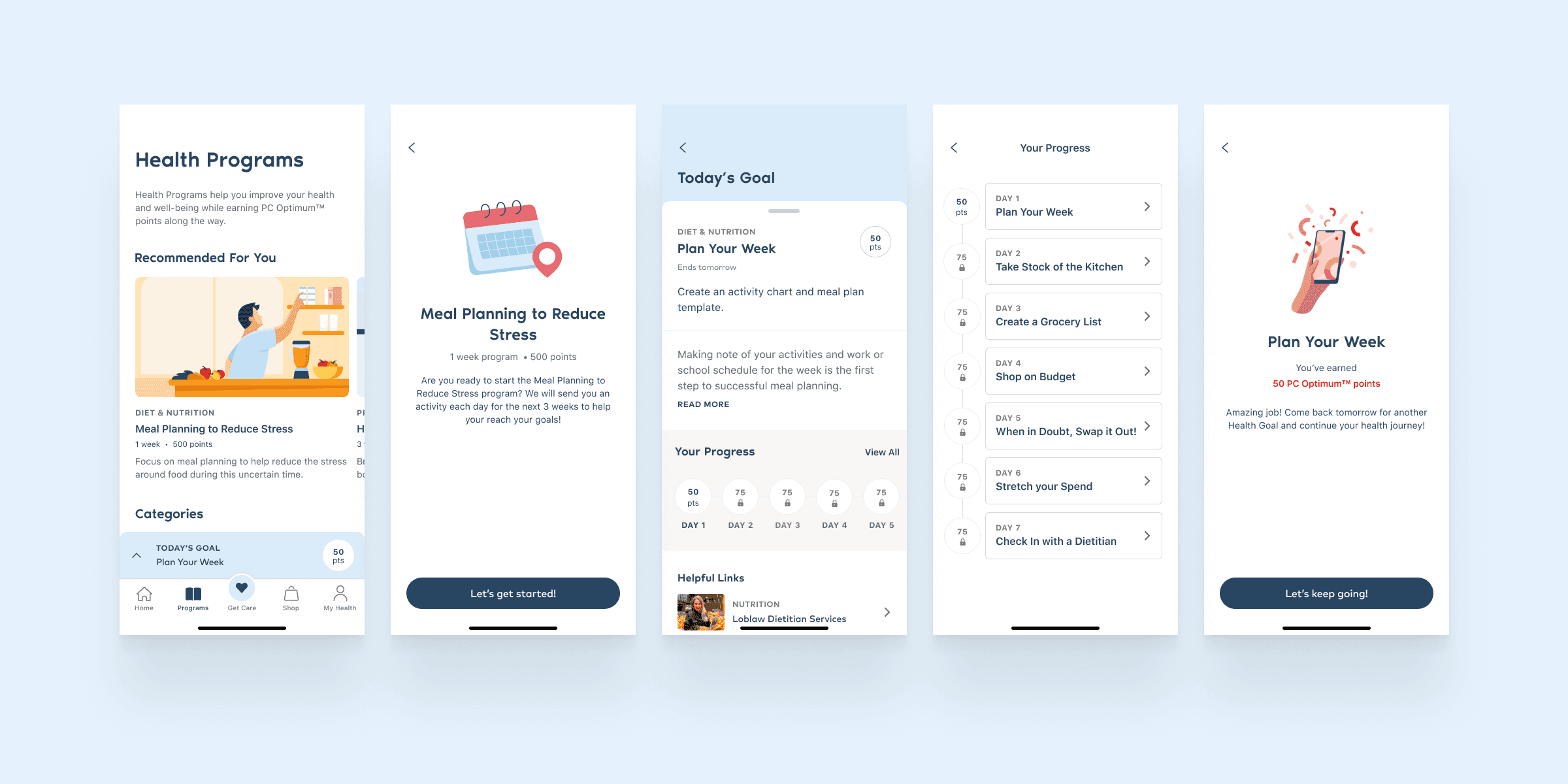
Health Programs is a feature in HBX that allows users to enrol in health and wellness programs to achieve their goals. In preparation for PC Health, Health Programs would be rebranded, shared, and expanded upon to allow users to earn PC Optimum points.
Health Programs screens for PC Health.
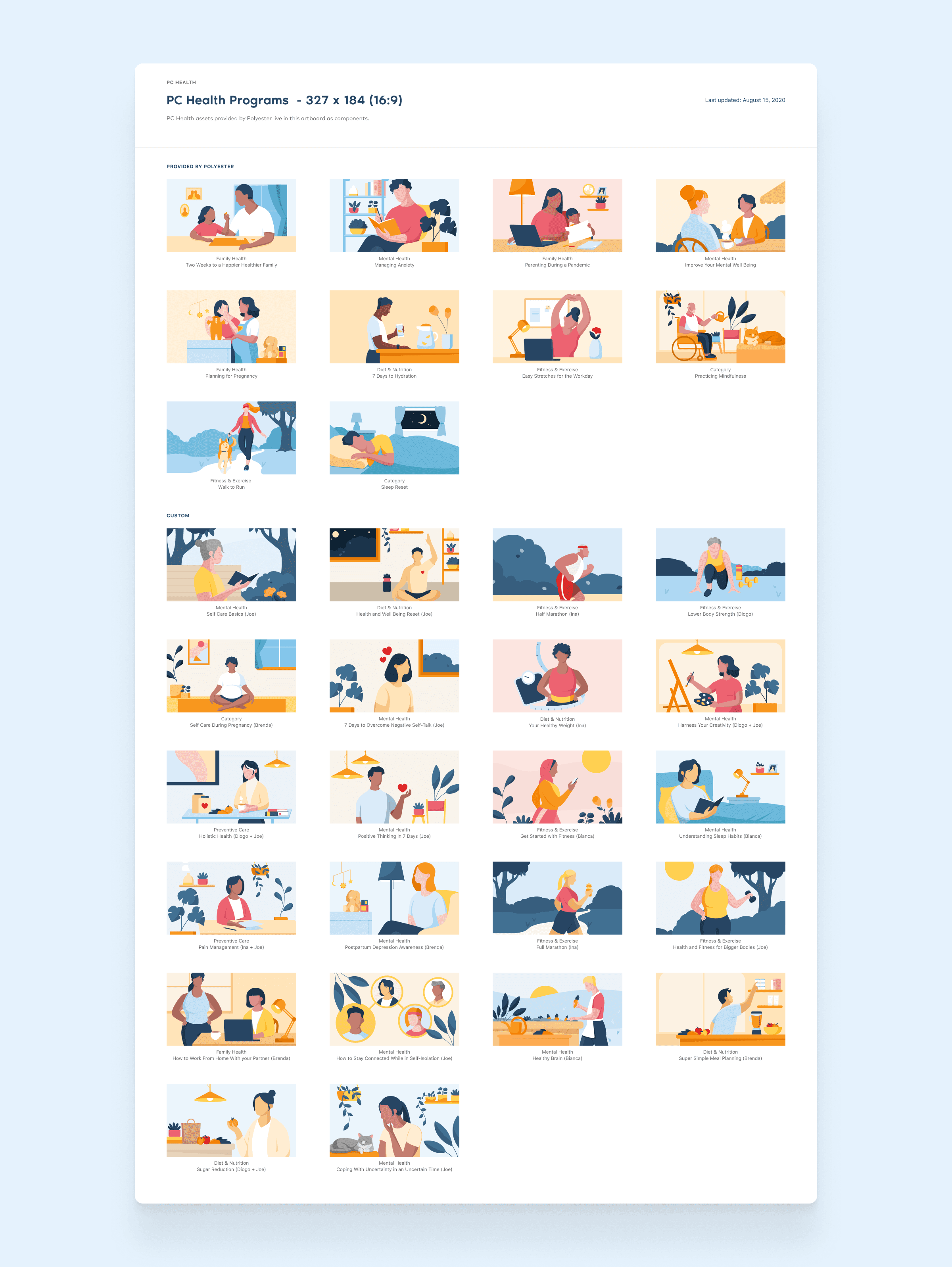
A challenge that came with this approach was crafting PC Health's visual brand identity. While this effort would normally be led by a partner agency — a lack of budget and an approaching deadline required League's own visual and product designers to take charge and quickly deliver. During a two-day design team hackathon, I was able to produce and iterate on illustrations for Health Programs, as well as create a Figma component library of all assets.
The result was an expansion of PC Health’s illustration library to foster a brand identity inclusive of race, gender, body type, sexual orientation, and age. During usability testing, when users were asked what their initial impressions were of PC Health’s visual design, the feedback was overall positive and associated with the app’s diverse set of illustrations and overall clean interface.
Health Programs Illustration Library with assets initially created by Polyester Design Studio, and expanded on by League’s Design Team. While working on some of these illustrations, I learned that hands are very difficult to illustrate :')
Geofencing
A temporary feature I was able to personally lead the design for was geofencing, a measure put in place to support PC Health's rollout on a region by region basis — meaning only users fromselect provinces could use the app before full release. This was a hard requirement from Loblaw to design, and it would appear right when a user launches the app.
Final Geofencing screens I created.
From an experience perspective, this feature would be hostile if a user from an unsupported province decided to download PC Health. In considering this, I wanted to create a flow that would still provide valuable information to users in outside provinces, considering all possible flows to lead to the desired result of increasing waiting list sign-ups. This was necessary to include, as to reduce the amount of potential uninstalls and negative reviews.
Evaluative User Research
A temporary feature I was able to personally lead the design for was geofencing, a measure put in place to support PC Health's rollout on a region by region basis — meaning only users from supported provinces could use the app. This was a hard requirement from Loblaw to design, and it would appear right when a user launches the app.
PC Health User Research Plan.
Prior to the app's soft launch, I was able to plan, conduct, and note-take for 7 usability tests alongside my mentor. With PC Optimum members who fit target user segments as our audience, we wanted to accomplish the following goals with our research:
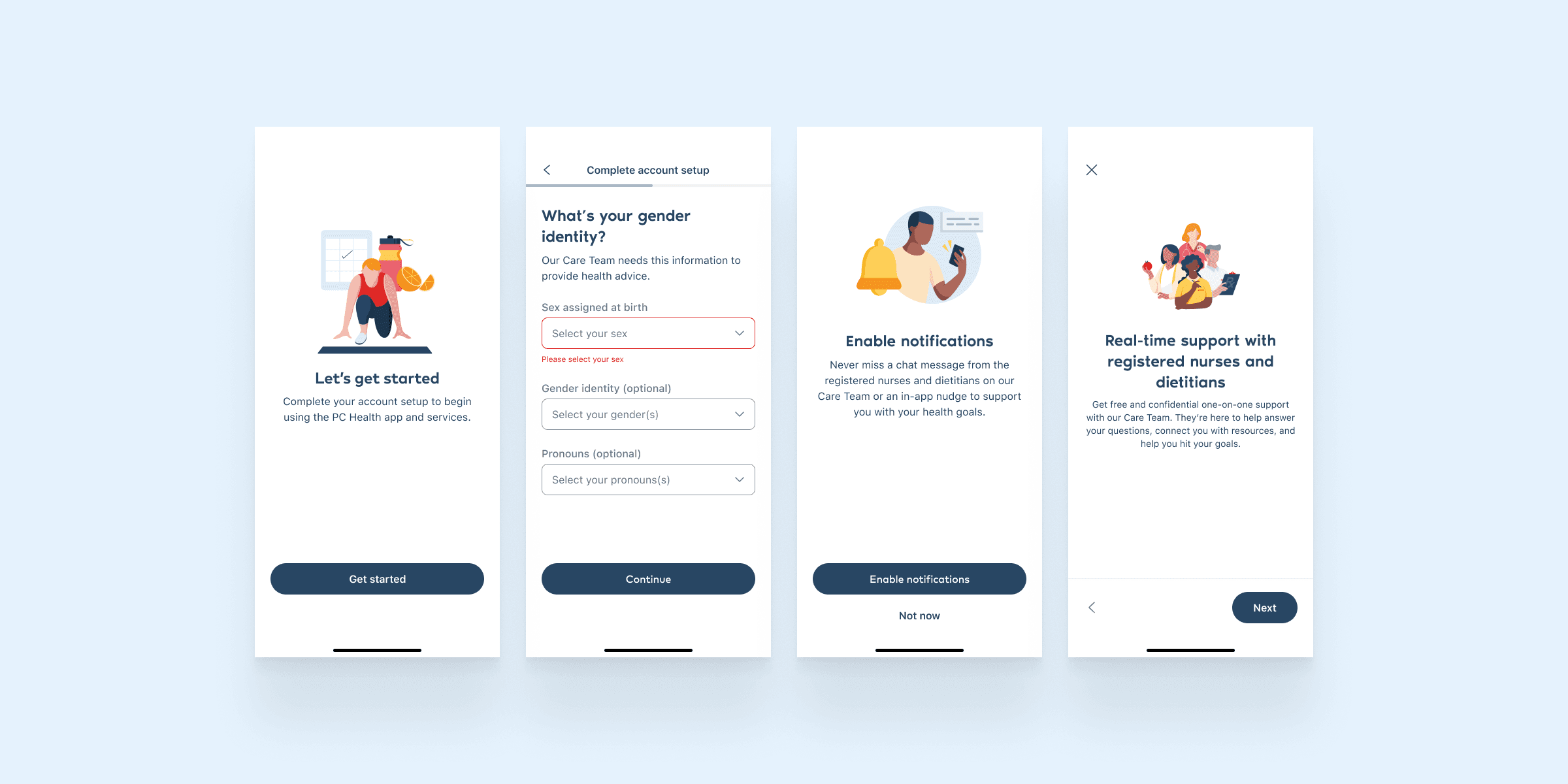
Understand if users find the app onboarding and account creation useful and informative.
Understand if users could find the appropriate care for their health needs.
Understand if users find PC Health easy to use and navigate.
Sample onboarding and account setup screens.
Our research aimed to gather insights on potential risk factors and signals to measure post MVP launch, as well as identify what our product did well and where it could improve. In speaking to target users, we were able to effectively validate that the product we were building was usable, would be useful to our target audience, as well as gather insights on feature expectations.
Results + What's Next
PC Health marked the first successful project under the Powered By League program, and serves as an exemplar to how League could work with different partners. As of February 2020, PC Health has over 2,800+ positive reviews on the App Store with a 4.6 star rating, is #3 on the Canadian Medical apps category, and is continuing to grow.
PC Health in the App Store and in the news.
Though my internship ended just before the MVP launch of PC Health, I imagine next steps for the project would be securing more Powered by League partners, as well as iterating on current HBX and PC Health features to better retain users and serve their health needs. This would entail tackling user pains identified in user research, measuring live feature performance to note areas of improvement, and listening to what users are encountering difficulties with in their reviews.
Measuring success through metrics such as app installs, positive reviews, health program completion, and “Get Care” user feedback and feature use will be critical for League. These metrics will dictate product-market-fit and be used as selling points to continue building a relationship with Loblaw, to secure new partnerships, as well as to inform where the Powered by League product can be improved and iterated.
Sample Powered by League assets created for the Business Development Team to use for pitches in sales meetings.
Learnings
1. Product thinking takes many forms 💡
Powered by League presented an interesting business model I wasn't exposed to before, and working on PC Health and designing for an external client was a great learning experience. It is meaningless to design without considering a company's business and product goals in mind, and understanding how this looks like for the product you’re working on is key.
2. User research is for your teams 📊
I was able to lead a few usability tests during this internship, which reinforced to me that research is incredibly helpful for defending design decisions among stakeholders. As a designer, it is your job to advocate for the user, and this is much easier to do with quantitative and qualitative data at your hand.
3. Diversify your feedback 📢
Design Review was one of my favourite weekly meetings at League. During these meetings, designers would invite relevant stakeholders from different teams outside of just design, such as product, engineering, support, and marketing. Opening my designs to different functions helped me learn how to communicate with different audiences, and gain valuable and focused feedback that considered a variety of perspectives to help improve my designs.
4. Good UX is grounded in good copy 📝
In working closely with a copywriter and testing designs and copy with target users, one learning that stuck with me was understanding that good copy can be used to set product expectations, clear confusions, and create stronger user experiences.
TL;DR
The most challenging part about working on such a large-scale project was being able to balance my work on all moving parts. Overall, I was able to learn the importance of product thinking and its different applications through this project’s unique business model, how to use user research to defend design decisions, how to effectively gather and apply feedback from a group of diverse stakeholders, and how to write effective copy. There is never enough time in any project, but the great thing about design is that after you ship something, you can iterate on your solutions by measuring how they perform and through gathered user insights.
PC Health prototype consisting of key screens, created for internal Loblaw and League stakeholders. Making this prototype brought me and my laptop to tears.
Though this internship was entirely remote, I was able to learn and contribute to so much in my short time as an intern. Special thanks goes to Diogo Ramos for taking me onto League's design team and for providing invaluable mentorship throughout my co-op!
